Euna Solutions
BRAND IDENTITY | CREATIVE LEAD | CAMPAIGN DESIGN
In May 2023, Euna Solutions emerged from the consolidation of nine public sector software companies. The challenge was to develop a cohesive brand and visual identity that would unify these diverse entities under a single, forward-thinking platform while maintaining the trust and recognition of their original audiences.
The rebrand focused on conveying Euna’s commitment to empowering public sector professionals through innovative, connected solutions. The visual identity needed to communicate clarity, simplicity, and the reliability that the public sector expects from its technology partners.
Through a strategic rebranding approach, we:
Unified the brand message
across multiple platforms, ensuring consistent communication to both internal and external stakeholders.
Preserved the legacy
of the original companies while establishing a fresh and modern identity that resonates with Euna’s forward-looking vision.
Enhanced brand recognition
and built a foundation for long-term brand loyalty by creating a visual identity that reflects both the past and future of the company.
This rebrand not only helped solidify Euna’s position in the public sector but also set the stage for future growth, making it easier for customers to connect with the brand’s mission of simplifying public sector solutions.

(Above) Visual Brand Guidelines
Industry and competitor research, surveys and interviews, and focus groups helped to define who Euna is.
Euna, its form and sound, is perceived as soft and approachable – pairing well with the themes of customer-centric and people-focused. But visually, it is also important to balance that with a bolder look to emulate themes of trust, purpose-built, and dependability.
Overall, we want our audience to know that Euna starts with them. By utilizing images and design principles where we place our audience as the heroes behind the work, we empower and engage them.
Designer and Art Director: Samantha Johnston
Communications Manager: Meghan Hennessey
VP, Marketing: Dina Baker
Agency Partner (Voice and Research): The Branding House

(Above) A sample of visual identity materials; whitepapers, stationery, digital ads, email structure and format, corporate website.
When reviewing the competitive landscape, the space is saturated in corporate blues and whites. Instead, we curated a unique and powerful colour palette to really stand out from the crowd. We are positioning ourselves as leaders in the space with an approachable tone.
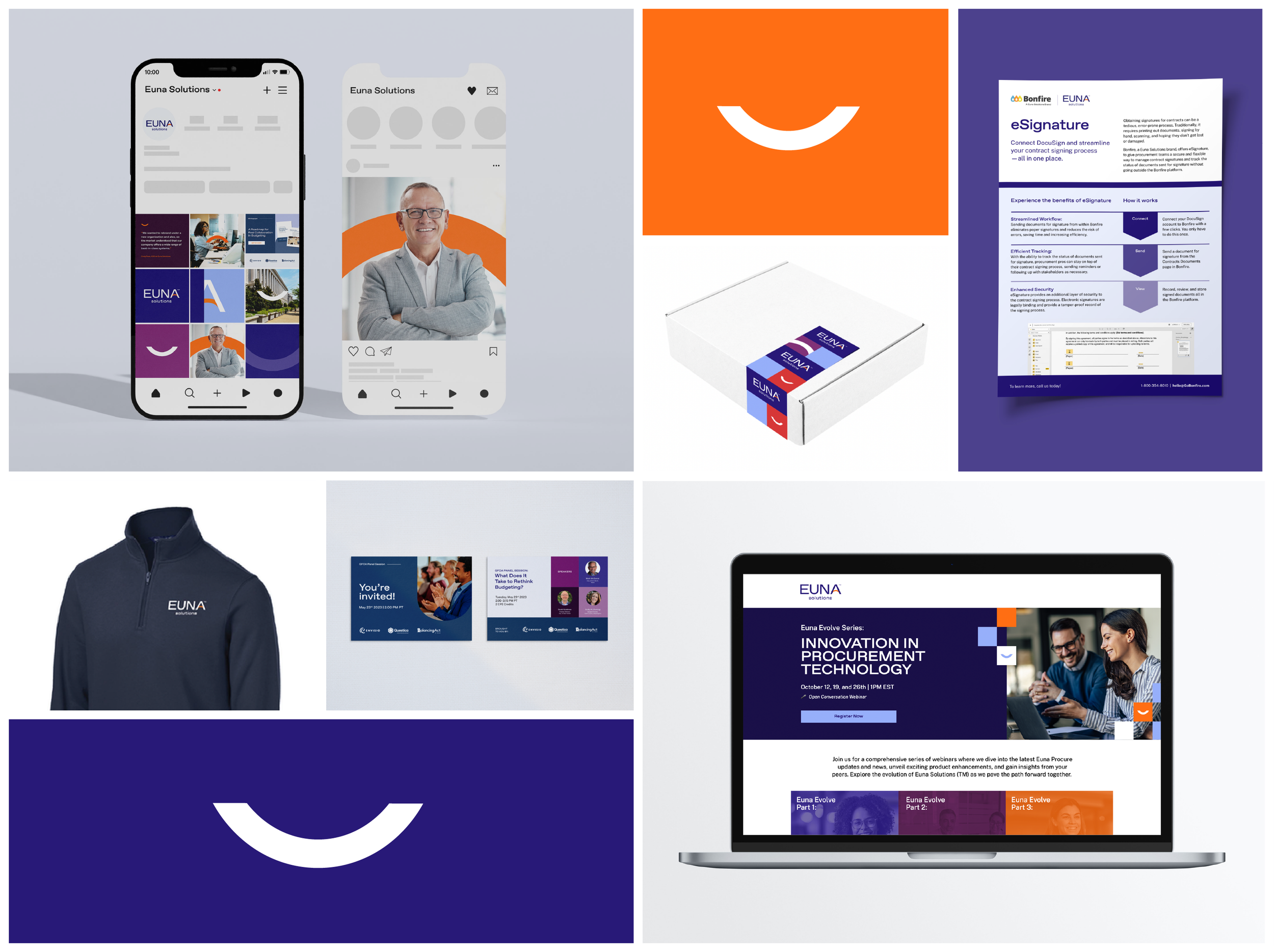
(Above) A sample of visual identity pieces; social launch campaign, swag package, demand generation speaker program.
We leaned in towards utilizing a softened stylized arch shape for the crossbar of the A in “Euna”. The arch, a strong structural shape, distributes stress evenly drawing the connection that we help simplify customers’ workflow. We also lean on the arch element to draw a bridge between our clients and a continuum of our solutions—representing the value of the consolidated company.

(Above) Event and field marketing collateral and brand presence – environmental
We have an intentional balance between the visual language that conservative government might be familiar with and something fresh and modern, confident and authentic so our clients can lean on us and trust us as they begin to modernize the way they work.

The consolidation of 9 existing brands presented branding challenges. We needed to introduce an endorsement phase to slowly establish brand recognition.
In some instances, high-profile campaigns such as the Procurement Awards (previously a Bonfire campaign) needed a redesign to fit the new Euna brand.
Still incorporating previous business unit logos, we succeeded in drawing the connection between all visual brands to improve audience adoption and reduce risk of churn and market share decline.
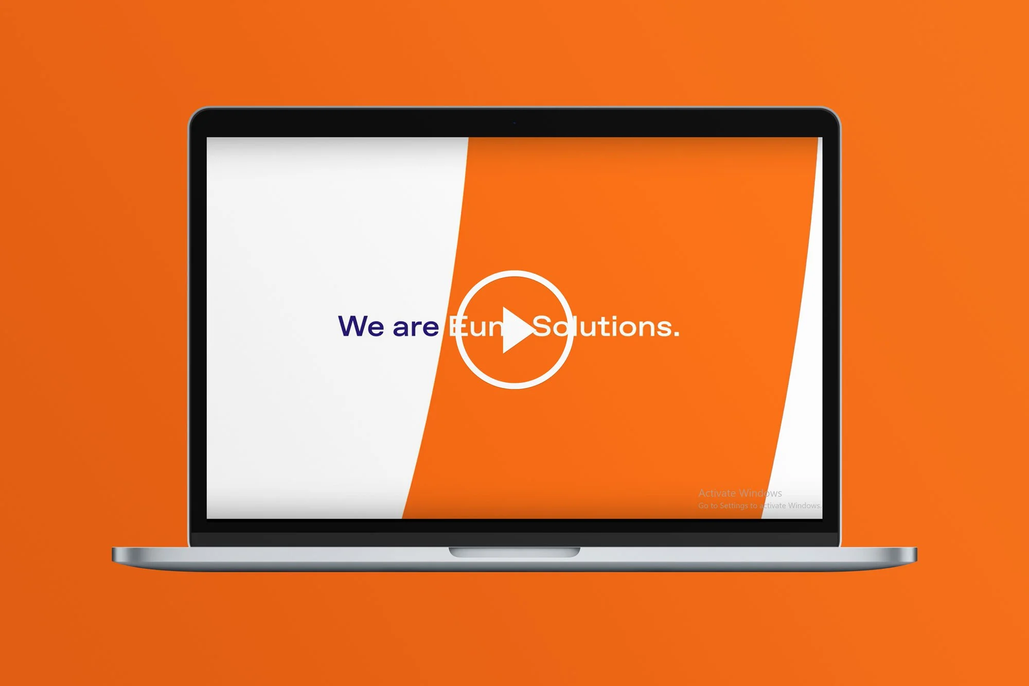
Euna Solutions Brand Launch Video
Art Direction and Visual Brand: Samantha Johnston
Script and Storyboard: Meghan Hennessey
Video Production Agency: Arc Media